


Give your Brand a Bang with Custom Candle Boxes
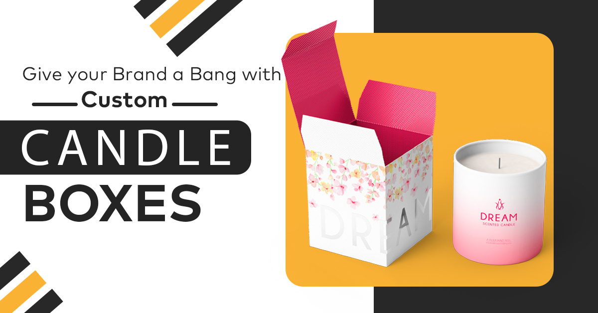
Walk down the candle aisle in any home goods store. Twenty brands, all promising warmth and calm, most of them in a variation of the same cream box with a serif font.
Now think about which one you would actually pick up.
It is rarely the prettiest box. It is the one that reads clearly from three feet away and looks like it belongs to a brand that knows what it is doing.
That is a design problem, and it has answers.
Your Boxes Gets About Three Seconds
A shopper scanning a shelf is not reading. They are sorting. In those first seconds they register three things in order. The silhouette of the box. The block of colour. Then the scent name.
Notice what is missing from that list. Your brand name.
At the point of first contact, the scent is doing the selling. Someone is looking for sandalwood or fresh linen, and your brand becomes relevant only after they have picked the boxes up.
This has a practical consequence. If your scent name is set smaller than your logo, you have the hierarchy backwards for the moment that matters most. Test it the honest way. Print the front panel at actual size, tape it to a wall, and stand back two and a half feet. If you cannot read the scent name comfortably, it is too small.
Every Panel Has a Different Job
Most candle brands design the front panel carefully and treat the other five surfaces as leftovers.
Each one is doing something specific.
|
Panel |
Its Job |
What Belongs Here |
|
Front |
Get picked up off a shelf |
Scent name as the largest element, brand name below it, one supporting visual at most |
|
Top of lid |
The flat lay photo |
Logo and scent name, centred and clean, since this is the angle most product photography uses |
|
Inside of lid |
The unboxing moment |
A short line, a pattern, or a thank you. This is the surface customers photograph and it is usually blank |
|
Sides |
Sell the scent up close |
Scent notes, top and base, burn time. Shoppers turn the box over when they are close to deciding |
|
Base |
Carry the required copy |
Net weight, safety warnings, business address, barcode |
Plan the base at the dieline stage. Legal copy takes more room than people expect, and squeezing it in later usually means shrinking the design or reprinting.
Design a System, Not Eight Separate Boxes
This is where most candle brands lose money without realising it. You launch with six scents. Each one gets its own artwork, its own colour palette, its own illustration style. On a screen they look wonderful.
On a shelf they look like six different brands sitting next to each other.
The fix is to build one template and change one thing. Keep the same box structure, the same layout, the same typography, and the same finish across the whole line. Then vary a single element per scent. Usually that is colour. Sometimes it is one small illustration in a fixed position.
Three things happen when you do this. Your shelf presence multiplies, because six boxes in one visual language read as a brand rather than as clutter. Your reprints get cheaper, since you are changing one plate rather than redesigning a box and adding scent seven next spring takes an afternoon instead of a new design project.
If you are working across several formats as well as several scents, the same rule applies. Jar candles, votives and tapers can all share one visual system while sitting in different custom candle boxes built for their shape.
Finishes: What Each One Says About You
Finishes are where budgets quietly disappear. Each one sends a different message, and they are not interchangeable.
|
Finish |
What it Signals |
Worth Knowing |
|
Matte lamination |
Modern, calm, considered |
The default for premium candles right now. Shows fingerprints on dark colours. |
|
Gloss lamination |
Bright, energetic, high contrast |
Makes colours pop. Reads more mass market than matte, which suits some brands and not others. |
|
Soft touch coating |
Expensive, tactile, worth holding |
The strongest premium signal per dollar. Scuffs visibly on dark panels. |
|
Spot UV |
Detail and craft |
A gloss highlight over a matte background. Best used on a logo or a small pattern, not large areas. |
|
Foil stamping |
Luxury, occasion, gifting |
Cost scales with the area covered. A foiled logo is affordable. A foiled full panel is not. |
|
Embossing or debossing |
Quiet confidence |
Works beautifully on kraft and uncoated stock, where ink alone falls flat. |
One warning about dark colours. Deep matte navy, charcoal and black photograph beautifully in a studio and show every scuff and fingerprint in a warehouse. If you want a dark palette, a subtle texture or a soft touch coating hides handling far better than flat matte does.
For candles above roughly forty dollars retail, most brands move to rigid packaging built for premium lines, where the structure carries as much of the message as the print does.
The Unboxing Is Part of the Design
When someone opens a candle they bought online, there is a sequence. Outer box, then lid, then whatever is inside, then the candle. Every step is a chance to say something, and most brands only use the first one. The inside of the lid is the biggest missed opportunity in candle packaging. It is the surface that faces the customer when the box opens, it is what ends up in photos, and on most boxes it is plain board.
Printing it adds a second pass, so there is a cost. At volume it is smaller than most people expect, and it is the cheapest branded surface you will ever own. A two piece box with a separate lid gives you the slowest, most deliberate opening, which is why gift candles tend to use them.
Five Branding Mistakes Worth Avoiding
Designing Screen : Your artwork will be viewed at full size on a monitor and at three feet on a shelf. Only one of those is the real test.
Undersizing Scent Name : The scent sells first. Give it the space.
Different Design Every Scent : One system, one variable. Anything else costs more and reads as less.
Forgetting Legal Copy : Warnings, net weight and your business address all need room. Design them in from the start.
Leaving Inside Blank : Free marketing, skipped.
If you want visual examples of what tends to work, our post on candle packaging ideas covers the execution side.
Final Thoughts
A box that gives your brand a bang is not the most decorated one. It is the one that reads clearly from a distance, holds together across your whole scent range, and still looks considered when the customer is holding it up close.
Get the hierarchy right, build one system instead of many, and pick finishes that match the story you are telling rather than the ones with the longest names.
Send us your scent list, your jar sizes and the look you are going for. Design support is free, there are no die or plate charges, and shipping across the US is on us.
Start with legibility rather than decoration. Set the scent name as the largest element on the front panel, keep one strong colour block, and test the artwork at actual size from a few feet away. Most boxes fail this test before design ever becomes the issue.
No. Keep one layout, one typeface hierarchy and one finish across the range, then change a single element per scent. Colour is usually the easiest variable. This keeps your shelf looking like one brand and makes reprints much cheaper.
Soft touch coating gives the strongest premium feel for the money, because it changes how the box feels in the hand rather than just how it looks. Foil stamping works well on a logo, though the cost climbs quickly if you cover a large area.
For candles sold online, yes. The inside of the lid is what customers see first when they open the box and what they photograph. It adds a print pass, but at volume the cost is small compared to the attention it earns.
Yes. Minimums depend on the material, since each board runs differently on press. Tell us the stock and quantity you have in mind and we will confirm the minimum for that spec when we quote.







 Let's Call