Get To Know Everything About Packaging Design Typography
Salman Shahid 2025-07-11 10:36:02

Typography is an important element in design that is needed to make any packaging successful. While a picture can speak a thousand words, at times brands have to use words on their packages to ensure the product is marketed the perfect way.
Designers have come up with visually appealing ways to make the text more interesting as it is printed on boxes and packaging bags. Typography is used to communicate the information, and every brand has its unique way of doing it. Read this blog to know about packaging design, typography, and how to use it to boost sales.
Why is Typography Used?
People often wonder why any need for typography is there when design can attract customers just fine. And while it is true to some extent, no brand can win sales and land customers without typography.
If you are looking for a dark roasted coffee and come across two different brands, one with exquisite design but no words, and the other with a good design and details, which one would you prefer? Of course, everyone will go for the one that has all the necessary information, such as the ingredients, any allergies to be cautious of, the weight of the product, and so on. This is why it’s important for brands to know about packaging design typography.
Strengthen Your Brand Positioning with Typography
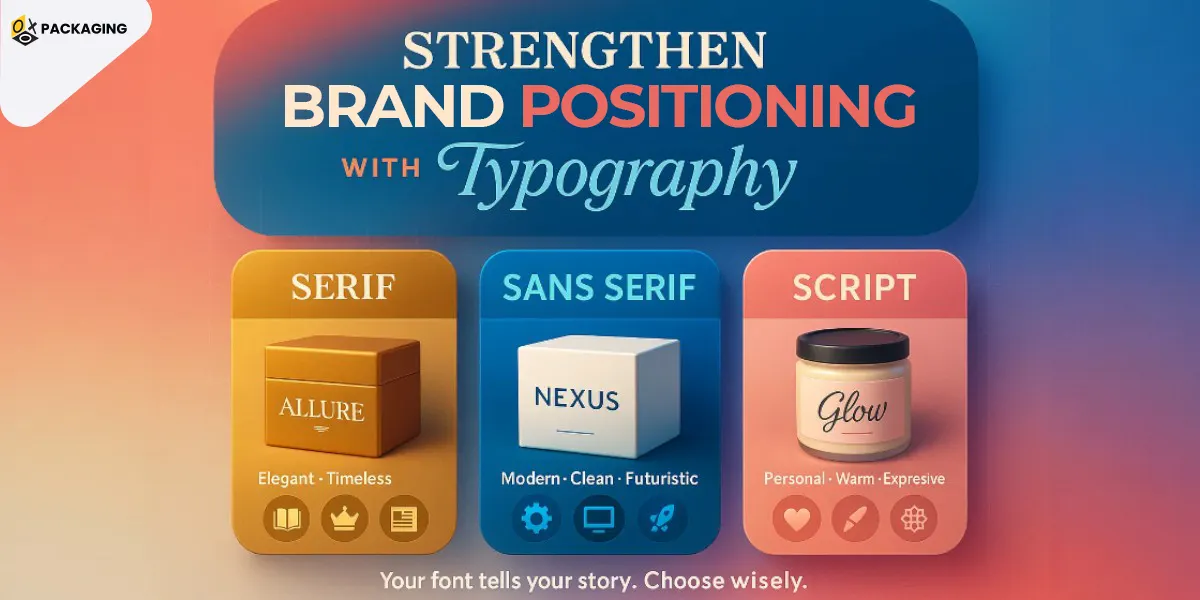
Every brand wants to offer a unique spin to their packaging, and this can be achieved through typography as well. This visual element assists brands with the correct positioning. The type of font you are using for your brand’s logo and throughout packaging says a lot about your brand persona. Let’s have a look at some of the common font families and what it means if your brand chooses one of them:
Serif
A lot of brands around us have been using the Serif font family as it offers a sober and decent touch to everything. Brands using this font represent an elegant and timeless look. This font screams vintage, and if you are looking to position yourself as a timeless brand, this font is the best one out there. Journalism, law, and even jewelry brands use this font.
Sans Serif
When looking to give your brand an edgy look with a dash of modernity, Sans Serif is the font to go. Big tech companies and even Netflix use the Sans Serif font for a futuristic look. This font is perfect for a cleaner look, and brands belonging to gaming, technology, consulting firms, and even the manufacturing sector choose the Sans Serif family.
Script
Script fonts have a more personal touch to them as they resemble handwritten letters. Most small businesses use the script font family to create a unique and personalized experience for customers. However, it is best if you keep the script font to a minimum on the packaging, as it can take up a lot of space and not have good readability. Many hospitality, retro, and beauty brands use this font family.
How Does Typography Help with the Hierarchy of Information?
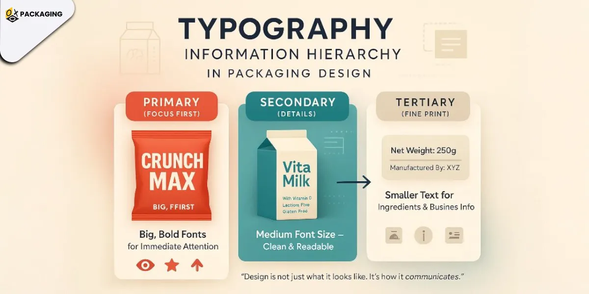
When adding information to the packaging, whether it is a packet of chips or a milk carton, the hierarchy is important to keep in mind. Dividing the information into three parts will help you in segmenting the information from the most important to the least important. Let’s have a look at the three parts of the hierarchy of information that every customer focuses on:
Primary
This is the part where the customer is going to focus on first. Using a bold and prominent font type for the primary information is important. Most brands use this part to create a robust brand identity in the market. Use your brand’s name and product’s name so these two are the first things the customer reads.
Secondary
When adding information regarding the product in detail, you have to use a rather smaller and cleaner font. Decorative fonts are not a good idea when adding details about the product, as they will take up more space and won’t be readable. To avoid customers from switching to another brand, use a clean font and add all the necessary information.
Tertiary
While this comes at last, it does not mean that tertiary information is not important. This is the part where you go for the numerical values. This means choosing the net weight of the product and the weight and grams of each ingredient used. You can also add your business details in this part. While this is the thing customers will read at last, it does not mean you ignore it.
Visual communication is very important when it comes to choosing the right fonts and how to place the textual information on the packaging. When designing your packaging, you must consult a professional to see where the right place is to add the text.
Market Your Brand the Perfect Way with OXO Packaging!
Marketing your products the right way means choosing the perfect packaging for every product to beat the competition. While custom packaging is not a surefire way to get more sales, it can significantly enhance them. From the type of material being used to the typography, every single element is very important when it comes to marketing your products. Getting professional help to test the designs and typography can assist your brand in choosing the perfect ones. Contact OXO Packaging today and get your custom packaging designed to attract more customers.
Typography is used to place the important text on the packaging in a creative manner to complement the design of the packaging.
When choosing the font for your packaging, keep in mind your brand’s persona. Decide on the right font after researching your competitors and consulting a professional.
Small businesses use display fonts and other font families that resemble handwriting to create a personalized experience for customers. You can do the same to attract and boost visibility.