A Detailed Guide on Visual Communication in Packaging

A Detailed Guide on Visual Communication in Packaging
Businesses are always looking for ways to improve their sales and enhance brand loyalty. One such way is through product packaging. Sensory pleasures are a major part of human experiences, and most brands use this as an opportunity to improve their sales. This is where visual communication in packaging comes in. Read this detailed guide to learn more about visual communication in packaging and how you can boost your product’s sales with it.
Impact of Visuals on Customers
Visual communication plays an important role in sales. Researchers have shown that a larger part of human satisfaction is brought about by the pleasure of the human senses. To occupy a prominent position in the market, brands pay special attention to the packaging visuals. Because most of the time, product packaging is the first thing potential customers interact with. Consequently, the visuals assist in boosting sales.
When businesses pay attention to incorporating the visuals that soothe the human senses, it helps in getting recognition and positively impacts the business. Research carried out in China showed how packaging visuals improved product sales when the same product was displayed for sale with two packaging designs. The new packaging design attracted more customers and therefore had more sales than the traditional packaging design.
What is Visual Hierarchy?
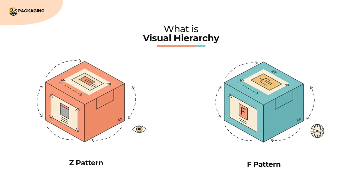
Visual hierarchy is strategically mapping out the design elements in a way that helps users pay attention to the design in a natural flow. In simple words, it’s the principle of arranging elements to show their order of importance. Nielsen Norman Group is a famous UX consulting firm in America that says visual hierarchy controls the delivery of experience.
In packaging design, some elements stand out more than others, which indicates the hierarchy of importance in that particular packaging. Businesses pay attention to the natural eye pattern of users when creating an effective visual hierarchy. This helps them in placing essential information in the right places for potential customers to take action. Let’s consider the two important patterns that most businesses use when designing packaging for their product:
-
Z pattern
This pattern follows the shape of the last letter in the English alphabet, Z. Viewers’ eyes move from left to right horizontally from the top left, and then down across the bottom left, and then right. This pattern is usually followed when the packaging design doesn’t have a lot of text. Most minimalist designs tend to follow the Z pattern.
-
F pattern
This pattern follows the shape of the letter F. Viewers start from the top left to the right horizontally, and then look down at the left side of the design. The F pattern is mostly used when the packaging design contains a lot of text. Viewers scan important information and skim through most text. Brands focus on highlighting essential information when they use this pattern to retain viewers’ attention.
Packaging designs do not always follow these two patterns. All that you need to know is where the eyes will land first and where they’ll end up eventually. Test your designs before you finalize them to see how certain designs will look on the packaging boxes. Finding automated tools can help your brand strengthen its position in the market. Many renowned brands like KFC, Pepsi, Lenovo, Samsung, etc. are using System1 to test their packaging for improved sales.
Impact of Design on System 1 and System 2 Thinking
System 1 and System 2 thinking was explored by psychologist Daniel Kahneman. According to him, System 1 operates without any voluntary control, whereas System 2 uses effortful mental activities. Visuals in packaging are favored by System 1 thinking as it focuses on the shape, color, design and printing.
Following his train of thought, you should also ensure that your visual hierarchy and your packaging are ultimately processed by System 1 of your customers. Put simply, you want visuals that appeal to your customers on an instinctual level. Designs that make your customers go “wow” at first glance will help you win more customers easily.
Elements in Visual Hierarchy
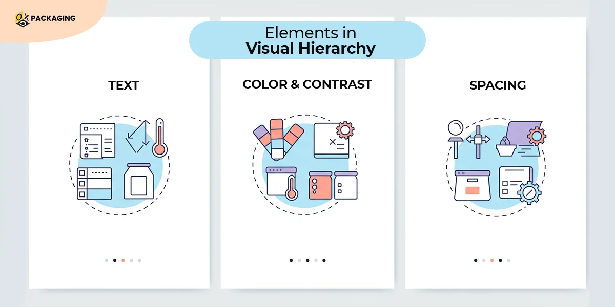
Visual hierarchy has a lot of elements that help a product strengthen its position in the market. The backbone of a good design is the right placement of these elements. By using these elements most effectively, your packaging design can assist in improving the product’s sales. Let’s have a look at the important elements in visual hierarchy:
-
Text
Almost every design contains text, even the ones with the simplest designs. Whether it’s your product’s name or information necessary for the users, the placement of textual information is important. Health, beauty, and food packaging rely heavily on textual information that helps potential customers to take action. Placing the text strategically on the packaging is what matters the most. Two important elements to keep in mind when designing the textual information on the packaging are:
-
Size
The size of the text on the packaging helps the brand guide viewers to pay attention to important information first. The textual information usually follows a hierarchy that contains three important parts:
- Headings
- Subheadings
- Body copy
This is the order in which the viewers look at the information and is also known as level 1, level 2, and level 3.
Level 1 must contain the most important information and should be very noticeable. Level 2 sometimes comes right under Level 1 information. The text is slightly less noticeable and is mostly used to piece the information together. The Level 3 or body copy contains the details that should be read last, but are important as well. Ensure the font size for the body copy is small yet readable.
-
Type
Test different types of font styles to see how well they work on the packaging. Choosing the font style relies on a lot of aspects, and one such aspect is the niche of your business. Another important aspect when deciding the right font style is your targeted audience.
Most businesses with younger people as their target audience use Sans Serif for its minimalist and clean look. When writing personalized messages on the packaging, use fonts that mimic handwriting well. Businesses with older people as their target audience do not use cursive font styles to avoid overcomplicating the design.
-
Color and Contrast
Improper combination of colors might not be very pleasing to the eyes. This is why it’s very important to know how to use colors on your packaging to attract customers. Saturation, value, and temperature are three important factors you must keep in mind when choosing colors for your packaging.
Saturated colors have less percentage of grey, hence they appear brighter than unsaturated colors. Using every saturated color on the packaging will not give it an appealing look. Similarly, temperature is the warm or cool tones in a color palette. Contrasting warm and cool tones will lift the design and attract more customers. If the background is dark, use light colors for other visual elements and vice versa.
-
Spacing
Spacing out your design and text is very important when creating a successful and appealing packaging design. While it may seem very important to add every piece of information on the packaging, you have to leave white spaces. These white spaces help the viewers in skimming through the text and appreciate a good design. The spacing is also important to isolate the key elements and make both the design and text appear uncluttered.
Research carried out in 2006 titled; Attention web designers: you have 50 milliseconds to make a good first impression! in Canada produced interesting results.
This research concluded that people form opinions about a website’s visuals in 50 milliseconds after looking at the website.
Although this finding about websites, it applies to the packaging design as well. Your packaging is more likely to perform better when the design is appealing. This is why you should focus on making your packaging appealing at the first glance.
Psychology of Emotional Packaging
Emotional packaging strategically uses visuals to evoke emotions. Businesses use emotional packaging for different purposes. It boosts sales and helps businesses, but emotional packaging also fosters relationships and builds brand loyalty.
As buyers have a lot of choices, tapping into the world of emotional packaging is important. Packaging design is a tangible representation of a brand’s identity. And every brand focuses on evoking emotions in a potential buyer the moment their eyes land on the packaging.
Businesses today are strategically using sustainability to foster connections and improve sales. Customers feel indebted whenever they see a brand promoting sustainability, and this helps brands get more customers.
Using rustic designs, choosing neutral and Earthy tones, and using renewable resources in packaging attracts customers. Most brands use actionable designs on packaging, promising to plant a tree on every purchase. These are some ways of evoking emotions in potential customers and forming a rich brand identity.
Smart Packaging
Smart packaging is another way of intriguing potential customers. When you think of smart packaging, usually QR codes pop up in your mind. But Phillips Bulb used a very different approach to attract customers to their products. Back in 2013, they launched new smart bulbs with smart packaging design.
The packaging was a simple black box with minimal text and a color card on the right side. There was an image of the smart bulk in the middle of the box. Upon turning the color card gently, people could see the light on the bulb changing color. This packaging helped the customers know what the bulb will look like if they purchase it.
They did not load all the technical information to explain how their smart bulb would work. This is how you can use visuals to convey the most important information and keep your design minimalist.
-
Eye Tracking
Eye tracking technology helps designers to understand what the important parts of a packaging are, where the viewers will look first. For the same purpose, a company in the US created a 3D simulation and placed a few different shower gels on the shelves.
They used different packaging boxes for the shower gels to see which ones perform better. They asked customers to wear the glasses so they could track the eye movements. A heat map was created that resulted in the company improving its packaging for a certain shower gel. It is better to use tools and track how visuals impact customers rather than hoping your new design will work.
-
AR
Augmented Reality (AR) has found its way into the packaging industry, where brands are allowing customers to experience the virtual world of a product. An Australian wine brand, 19 Crimes, uses AR to make history lessons fun. Every bottle has a convict from the 18th century, and using AR, the brand tells the story of that convict. All that the viewer has to do is scan the labels with their smartphone to get to know the convict while enjoying their wine.
Similar pharmaceuticals use AR that helps customers know essential information about the medication they are about to purchase. This way, brands can have white spaces and not have a load of information that becomes too overwhelming for the customers.
Set Your Brand Apart with Effective Visuals on Packaging
Visuals on packaging influence a customer’s purchasing decision and can help businesses boost their sales. Understanding your brand's identity will help you in creating effective packaging designs. Incorporate the visual hierarchy in your packaging to attract customers. Find ways to spark emotions through visualization so you can foster relationships with your customers.