


How to Choose the Right Color Scheme for Printed Food Packaging Boxes
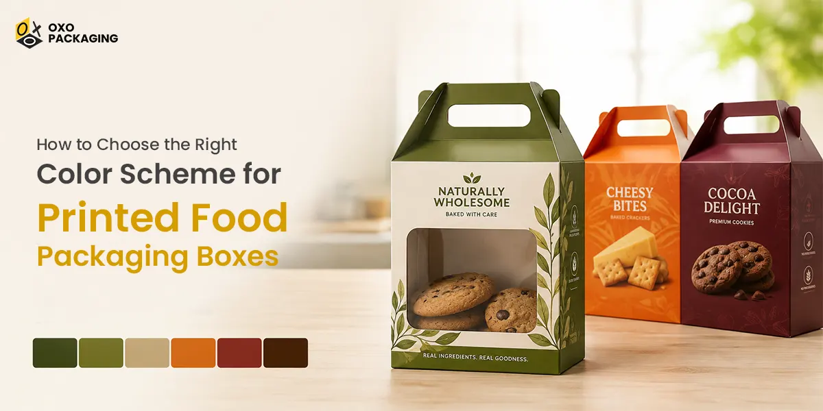
Colour is one of the first things customers notice when they see a product on a shelf. Before reading the ingredients or brand name, shoppers often form an impression based on the packaging colours. For food brands, the right colour scheme can make products look fresh, delicious, premium, natural, or exciting.
Choosing suitable colours for printed food boxes is therefore an important part of branding. A thoughtful colour palette can improve recognition, communicate product qualities, and encourage customers to pick your product over competitors. Whether you sell bakery items, snacks, frozen foods, cereal, or takeaway products, your colours should support your brand message.
Why Colour Matters in Food Packaging?
Packaging does more than protect food. It also communicates what customers can expect from the product. Colours can influence emotions and purchasing decisions within seconds.
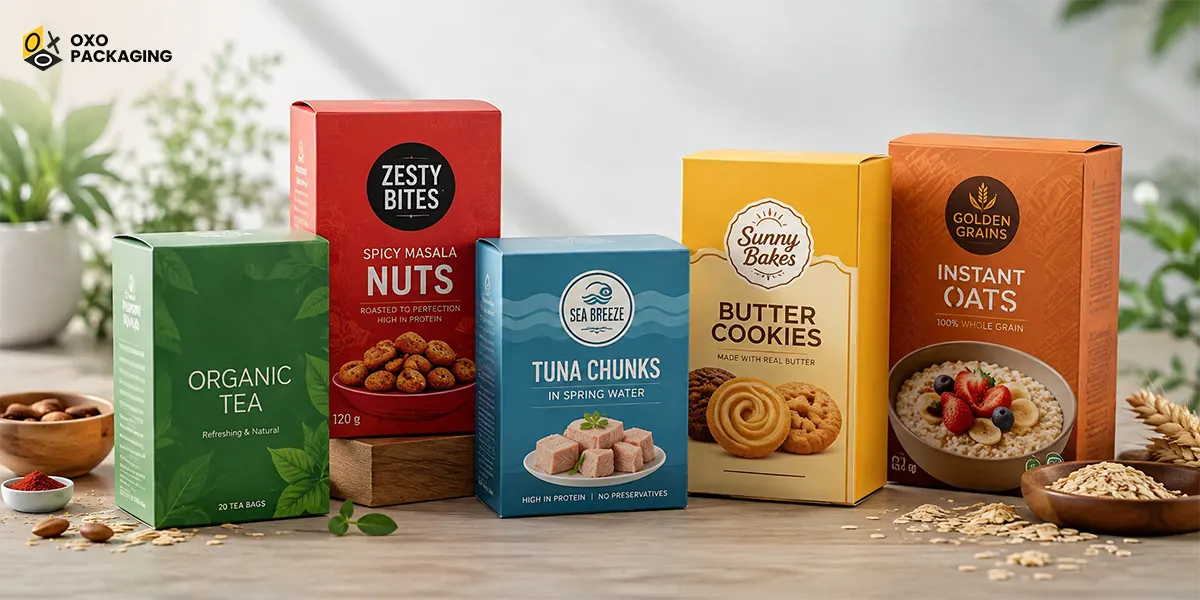
For example, green is commonly associated with nature, freshness, and sustainability. Red can create feelings of excitement, energy, and appetite. Blue often communicates trust and cleanliness, while yellow can suggest happiness and optimism.
This concept is known as packaging color psychology. Understanding the associations helps businesses select food box printing colors that match their products and target customers.
The goal is not simply to choose attractive colours. Your colour scheme should create a clear connection between the product, brand, and customer expectations.
Understand Your Brand Before Choosing Colours
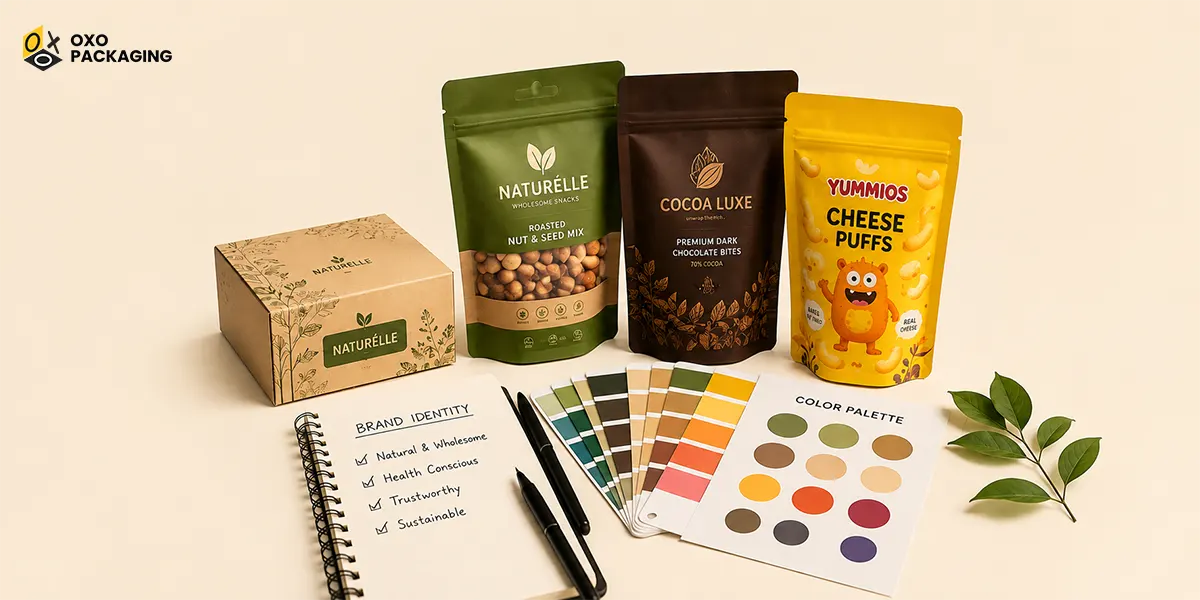
Start your custom food packaging design with your brand identity. Consider your logo, existing colours, typography, product positioning, and target audience.
A premium chocolate brand may benefit from deep brown, black, cream, or metallic shades. A healthy snack company may prefer earthy green, beige, or natural kraft tones. A children's snack brand may use bright and playful colours.
Firstly, ask yourself:
- What does my brand represent?
- Who is my target customer?
- Is my product premium, affordable, natural, or playful?
- What emotions should customers associate with it?
- Which colours are already connected with my brand?
Answering these questions creates a strong foundation for your packaging design.
Use Packaging Colour Psychology Effectively
Understanding packaging color psychology can help you make strategic color choices.
Red for Energy and Appetite:
Red is bold and attention-grabbing. It can stimulate excitement and is frequently used for food products because of its strong visual impact. It works well for sauces, snacks, fast food, and spicy products.
However, excessive red can make packaging feel overwhelming. Balance it with neutral or lighter shades when necessary.
Green for Freshness
Green is strongly associated with nature, freshness, health, and organic products. It can be an effective choice for vegetables, herbal products, organic snacks, and environmentally conscious brands.
Pair green with white, cream, or earthy tones for a natural appearance.
Yellow for Happiness
Yellow creates a cheerful and energetic impression. It can make food packaging look friendly and approachable. Yellow works particularly well for breakfast products, snacks, sweets, and children's food.
Use darker complementary colours for text to maintain readability.
Blue for Trust
Blue often communicates reliability, cleanliness, and calmness. It can work well for dairy products, bottled foods, frozen products, and brands that want to create a professional appearance.
Because blue is less strongly associated with appetite than warm colours, use it strategically within food packaging.
Brown and Beige for Natural Appeal
Brown, beige, and other earthy colours can communicate warmth and natural quality. These colours are especially useful for bakery products, coffee, organic foods, and sustainable packaging. They also work particularly well with kraft materials
Consider Your Product Category
Different food categories often require different visual approaches. Your colour should immediately help customers understand the product.
For example, custom bakery boxes can use warm cream, brown, or golden tones to create a comforting appearance. Fresh food packaging may benefit from green and white combinations. Snack packaging can use vibrant colours to stand out on busy retail shelves.
For premium foods, darker colours with metallic accents can create a luxurious appearance. Meanwhile, natural products may look better with muted and earthy shades.
These food packaging design ideas can help you develop a visual identity that feels appropriate for your specific product.
Create A Balanced Colour Palette
Avoid using too many colours without a clear purpose. A simple palette often creates a stronger and more professional appearance.
A useful approach is to select:
- One primary brand colour
- One or two supporting colours
- One neutral colour
- An accent colour for important details
Your primary colour should dominate the packaging, while supporting colours can separate different information areas.
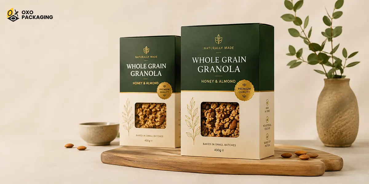
For example, a food brand could combine dark green as the primary colour, cream as the neutral shade, and gold as an accent. This combination could create a premium and natural appearance.
Make Sure Text Is Easy to Read
An attractive colour combination is not useful if customers cannot read the packaging. Always consider the contrast between the background and the text.
Dark text usually works well on light backgrounds, while white text can stand out against dark colours. Avoid placing similar shades together because they can reduce readability.
Important information such as the product name, flavour, ingredients, and brand name should remain clear.
Before finalising your custom printed food boxes, review the design at actual print size. A colour combination that looks good on a computer screen may appear different when printed.
Think About Printing and Material
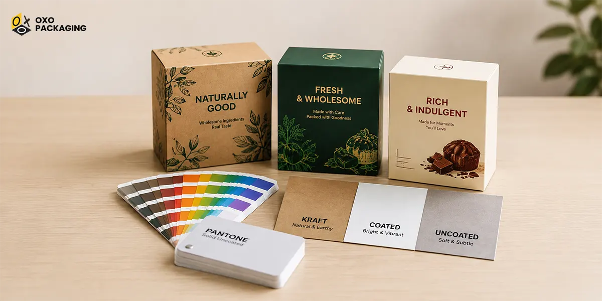
The final appearance of food box printing colors can depend on the packaging material and printing process. Kraft, coated paperboard, and uncoated cardboard can produce different color results.
Kraft packaging, for example, has a natural brown base that can change how printed colour appears. Bright colours may look softer, while earthy shades can blend naturally with the material.
For more vibrant and precise colors, coated materials may provide a smoother printing surface. Discuss your desired colour results with your packaging supplier before production.
Test Your Colour Scheme Before Printing
Never rely only on assumptions when selecting colors. Create digital mockups and physical samples before placing a large packaging order.
Evaluate the design under different lighting conditions. Check whether the logo remains visible and whether important information is easy to read.
You can also ask potential customers for feedback. Simple questions about which packaging looks most appealing, premium, fresh, or trustworthy can provide useful insights.
Testing reduces the risk of investing in custom printed food boxes that do not achieve the desired effect.
Conclusion:
Choosing the colors for printed food packaging boxes is not just about picking colors that look nice. Your choice of colors should show who you are as a brand, what kind of product you have, who you are trying to reach, and what you want to achieve with your marketing. Knowing how colors affect people, making sure the colors work together, making sure the text is easy to read, and thinking about the materials you will print on can lead to better outcomes.
There are different food packaging design ideas to choose from. You can go with natural kraft designs or rich dark colors, or bright colors for snacks. The right mix of colors can make your products stand out, show that your product is of quality, and get customers to pay more attention.
Spending time on the colors for your food box printing can turn simple packaging into a strong tool for building your brand.
Red, green, yellow, brown, and blue can work well for food packaging. The best choice depends on your product, brand identity, and target audience.
Packaging color psychology influences how customers perceive a product. Colours can communicate freshness, quality, excitement, trust, or natural appeal.
Use distinctive colours, clear typography, attractive graphics, and consistent branding. Your custom printed food boxes should also contrast effectively with competing products.







 Let's Call