


The Secret to Making Your Logo Pop on Brown Kraft Boxes
Kraft is a natural, rustic, and brown colored paper used largely for the packaging of the products. The frustration creates when they are put to print, especially branding elements like logos and custom images. You can create your packaging with clear and vibrant printing output. You need to use some smart techniques and tactics.
This guide will help you get a comprehensive understanding by exploring the reasons to find the solution to this issue. Let's explore everything from the variations in your logo printing to making smart moves with your intelligent printing decision for your brand.
Understanding the Kraft and Printing Connection
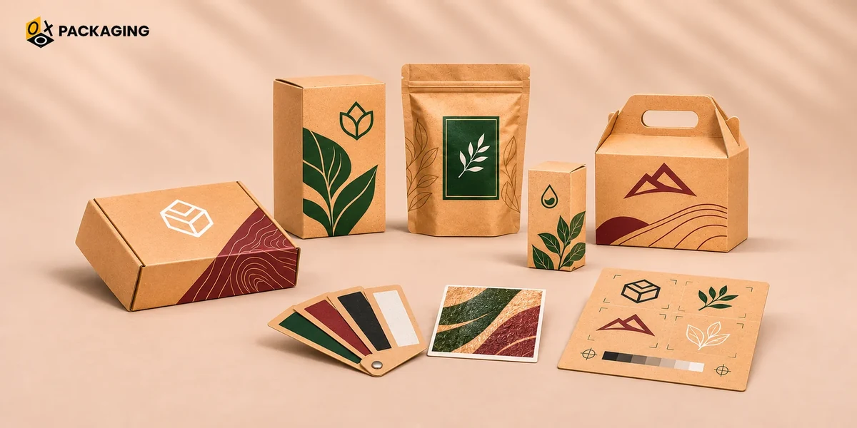
Frustration is natural when you pay no attention to the printing on kraft boxes. You might be inclined to print your packaging boxes on fresh and natural kraft paper without knowing what might happen to your brand colors, especially when you choose the resonating or similar colors. One more thing you need to consider is not to be satisfied with the screen colors on your computer.
Printing contrary to your expectations is quite natural, and you should also understand that this is normal it’s not a printing mistake; it’s just how ink interacts with brown paper. Let's open the secret why this happens and know the simple tricks to make your logo look amazing next time.
Let's dive into the details of the reasons and their solutions to the hue shifts:
Reason 1: Brown Paper Acts Like a Tinted Filter
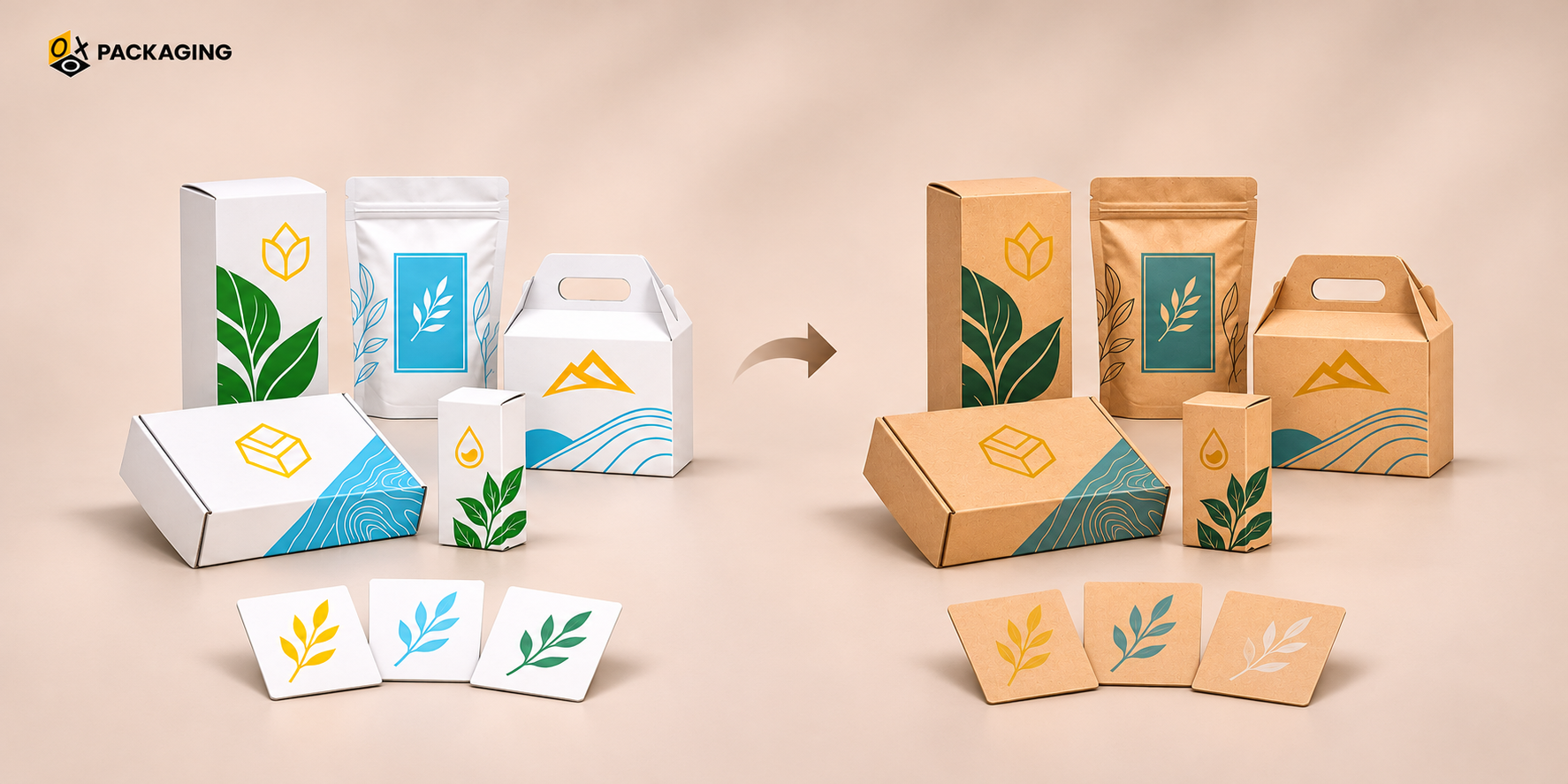
Uncoated, natural paper, and brown kraft boxes have a special type of paper that can affect your color printing to a great extent, as it acts as a tinted filter on your printing outcomes. Consider the following in detail:
-
The "Sunglasses" Analogy
Simply take a simple and easy-to-understand simile: printing on brown kraft is like looking at your logo through brown-tinted sunglasses. It will behave the same as it looks in this scenario.
-
Ink is Translucent
Standard printing inks are quite thin and cannot create a barrier against the base surface of the packaging materials; hence, they let the color underneath show through.
-
Real-World Examples
Simply use the color combinations shown below for your convenience:
|
Input Color Combination |
Output Color |
|
Yellow ink + brown paper |
mustard or muddy green |
|
Light blue ink + brown paper |
dark teal or muted gray |
|
White ink |
disappears completely (unless you use special opaque white ink) |
Reason 2: Kraft Paper Soaks Up Ink Like a Sponge
Not every material behaves the same, as kraft paper soaks up ink like a sponge while others reflect it as it is. Continue to read the following:
-
Uncoated vs. Coated
You can just imagine what will happen when you choose glossy white paper that acts just like a smooth plastic plate that is entirely different behavior to uncoated kraft paper, which is more likely to give an output with a textured and porous like a paper towel.
-
The Result
Kraft fibers absorb ink; colors lose their brightness and look softer, flatter, and more matte. While other smooth and glossy paper cannot do the same and show the same output as displayed on the screen.
Reason 3: Screens Glow, Boxes Don’t
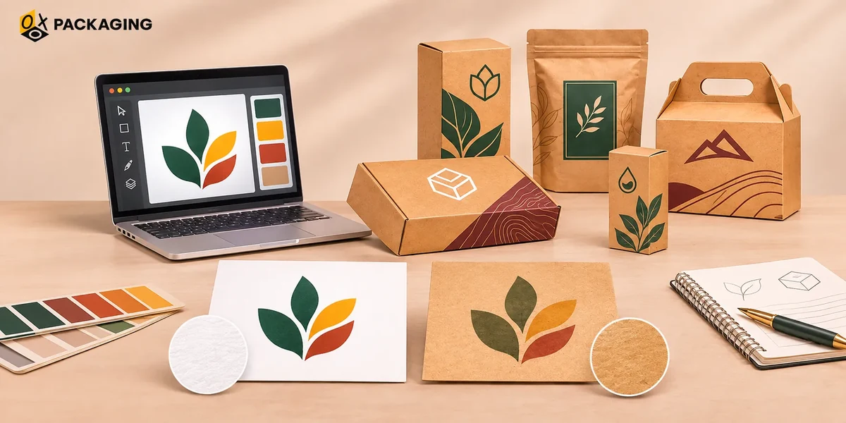
The screen displays entirely different output, as it doesn't show how the surface of certain material will affect the forecolors. Have a look at the following:
-
RGB vs. CMYK
Phone and computer screens shine light through colors to make them look bright and neon. In actuality, on the material surface, it does not perform the same. This is the basic difference between RGB and CMYK.
-
Paper Reflects Light
Like a plastic sheet, ink on a cardboard box relies on room light bouncing off it, which naturally makes colors look a bit darker, whereas in actual case with the kraft paper is entirely different.
4 Easy Ways to Make Your Logo Pop on Kraft
Keep on moving ahead to learn how you can make a difference by learning and implementing the four easy ways to make your logo pop on Kraft:
-
Stick to Dark, Bold Colors
Black, dark navy, burgundy, and forest green look crisp and intentional on brown backgrounds. So keep on using such dark colors for a brighter and vibrant look.
-
Add a White Ink Base
Adding a white ink base can enhance your logo presentation, even on bright custom packaging boxes. So, ask your printer to lay down a layer of solid white ink under your colored logo, and the true colors will shine through.
-
Embrace the Vintage Vibe
Lean into the earthy, eco-friendly aesthetic instead of fighting it keep on using a nature-inspired or organic aesthetic, botanical or biophilic style, and experience how sometimes a slightly muted look adds rustic charm.
-
Always Order a Sample
It is wise to test a short run, a mockup, before you finally jump to the bulk quantity order for your design on a real physical box.
Drawing Conclusion
Kraft is a unique brown paper material that reflects different colors differently and might create an entirely different output than it looks on the computer screen. You need to understand that kraft paper naturally softens colors, and choosing high-contrast shades makes all the difference. Reconsider your custom kraft packaging before you finally choose to print colors, and have a test run before bulk printing your kraft boxes for your brand for a greater and more reliable experience.
Kraft is a natural, brown, and rustic paper material. It requires the right light source, resonates with or supports surrounding colors, and also depends on how human eyes and brains process wavelengths. Key reasons hue shifts occur might include the color inconsistency, blue-yellow asymmetry, simultaneous contrast, brightness and low light shift, and so on.
For the excellent color printing to meet the required output on the kraft paper packaging boxes, you need to prioritize high-contrast dark or white inks, thick strokes, simple shapes, and you also need to hold up against textures. Choose absorbent brown board and limit color count, keep text large enough, match method to volume and look, avoid folds and labels, and finally test a physical proof for better printing results on kraft boxes.
OXO Packaging is a leading custom packaging solution provider in the USA. Choose us to get outclassed custom kraft boxes with the perfect logo printing tailored to your brand's original colors and hues. Order your custom kraft boxes now with your brand logos.






 Let's Call