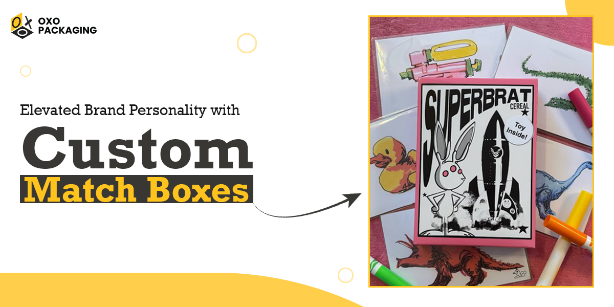
Elevated Brand Personality with Custom Match Boxes

Elise Robinson is a creative designer and artist known for her bold, expressive visual style that fuses humor and pop-art flair. For her latest project under the “SUPERBRAT” label, Elise wanted to create packaging that not only protected the product but also served as an extension of her artistic identity. She needed match boxes that looked vibrant, felt premium, and communicated her playful, rebellious brand spirit at first glance.
The Challenge of Our Client
Elise faced a common creative dilemma while translating her vivid, detailed artwork into tangible packaging without losing its sharpness or personality. Her previous experiences with generic prints, muted colors, and delayed responses left her frustrated.
She needed a packaging partner that could understand her design language and deliver flawless quality within tight timelines. Her vision was clear to make her match boxes stand out on shelves, carry a collectible appeal, and stay true to her brand’s quirky aesthetic.
The Ideal Solution OXO Proposed
When Elise connected with sales representative “Jason” from OXO Packaging, the collaboration clicked immediately. Jason and our OXO team took the time to understand the “SUPERBRAT” concept, which was a mix of retro cartoon charm and subversive modern art.
Key stepsOXO implemented included:
- Precision Color Matching: Used advanced CMYK printing to capture the exact pink and black tones that Elise envisioned.
- Material Selection: Enhanced color contrast while maintaining durability by choosing smooth matte cardstock.
- Customized Die-Cut Design: Ensured perfect fit for match sticks and collectibles while offering enough surface area for Elise’s artwork to shine.
- Rapid Prototyping: Delivered 3D mockup designs for Elise’s approval within days, ensuring every detail was aligned with her creative expectations.
Throughout the process, Elise praised the “quick response time” and “incredible service” that made the project stress-free. The OXO team maintained open communication, ensuring each iteration was approved swiftly and efficiently.
The Result
The final product, “the SUPERBRAT Safety Matches,” exceeded expectations. The vibrant pink-and-white palette printed crisply, the bunny logo retained its fine lines, and the tactile finish gave the packaging a boutique feel.
When Elise received the match boxes, her reaction said it all:
“SO so good. Incredible service, quick response time, and the quality is exceptional. Worth every penny. Shout out to my guy Jason over at OXO! You rock!”
You can also read Elise Robinson’s review to see her full feedback and experience with OXO Packaging.
Her customers loved the packaging so much that many began sharing photos on social media while turning the match boxes into collectible art pieces rather than simple utility items.
Key Takeaways and Impact
For Elise Robinson, OXO Packaging was not just a supplier; it was a creative partner that brought her imagination to life. This project is a testament to OXO’s commitment to craftsmanship, communication, and creative collaboration. The SUPERBRAT Safety Matches are now more than packaging; they are a piece of branded art that perfectly reflects the personality behind them.


