


A Guide to Typography and Logo Placement on Cosmetic Boxes
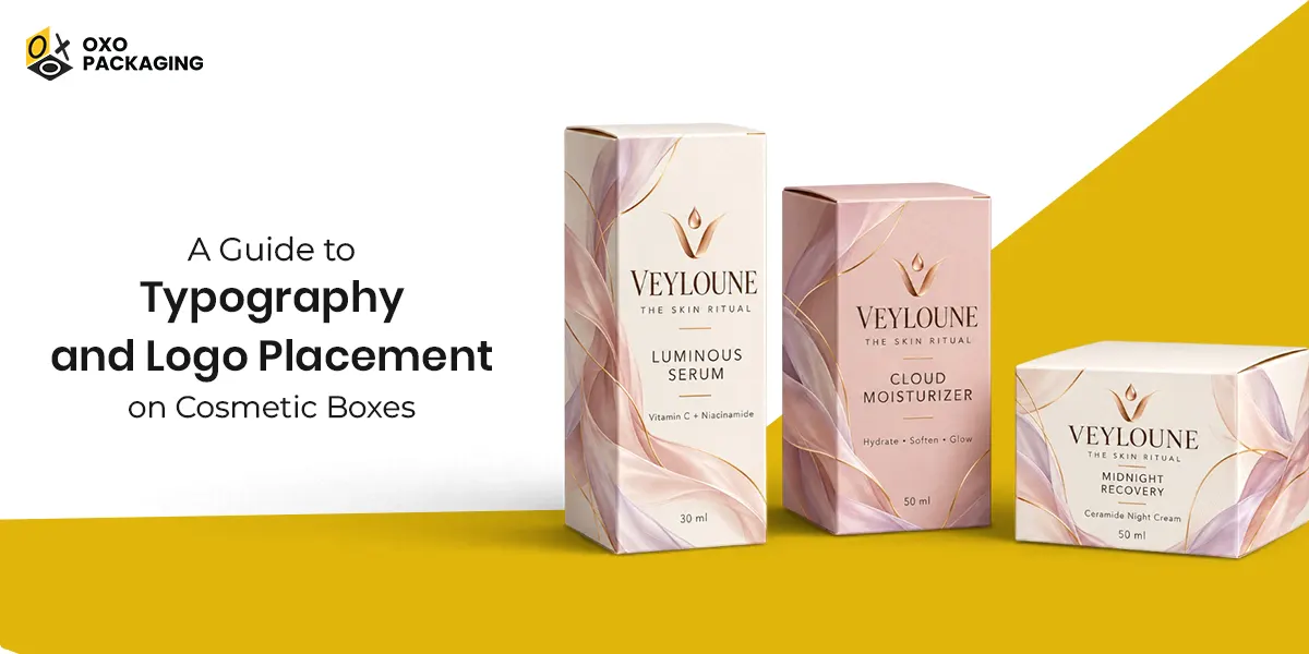
Modern consumers form an impression of your brand through packaging before trying your product’s formula. Their buying decisions happen in seconds. That's where strategic typography and logo placement on custom cosmetic boxes matter.
So, choosing the right typefaces influences consumer emotions. And the right logo placement conveys your brand values. Balancing clean spacing with a prominent logo on a principal display panel is key to your brand's success. Wondering how? Explore this blog in detail:
The Typographic Guide for Cosmetic Boxes
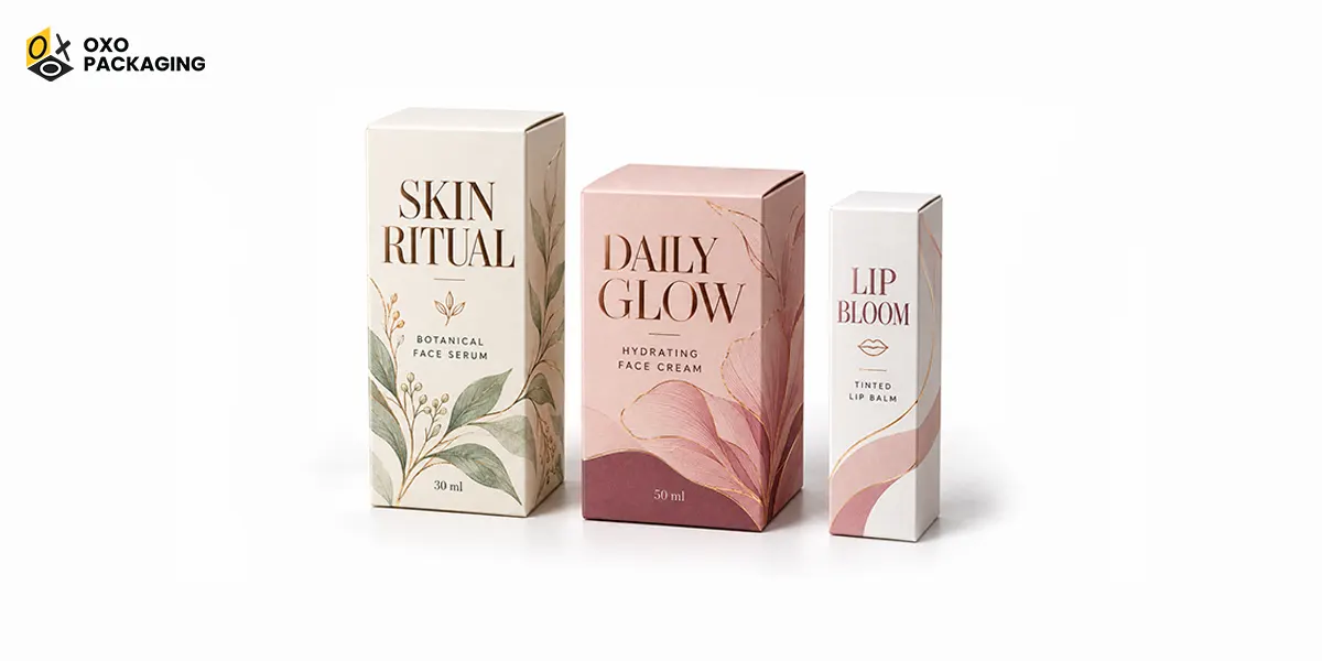
Typography starts with the letters on your beauty box. So understand how typography becomes the silent advocate for your cosmetic brand, shaping perception before a customer even opens the box lid.
Font Psychology and Emotional Positioning
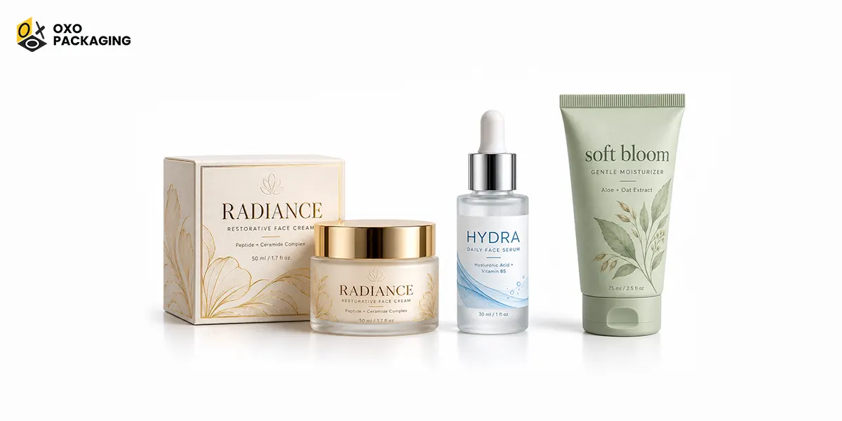
Different typeface styles trigger specific psychological associations. Aligning your typography with your target audience is important. Following this, make the right choice:
-
Sophisticated Serifs
High-end cosmetic brands use serifs with fine stroke contrast and graceful proportions. They naturally evoke prestige, craftsmanship, and exclusivity, making your beauty products feel instantly more valuable.
-
Clean Sans-Serifs
Modern skincare lines leverage sans-serif fonts to communicate purity, transparency, simplicity, and scientific credibility. Many skincare and wellness brands project that their products are hygienic and modern by using sans-serifs.
-
Letterform Geometry
The shape of your typefaces also matters. Soft, rounded letterforms communicate warmth, self-care, and natural beauty. On the other hand, sharp, high-contrast serifs suggest luxury, while minimal, geometric sans-serifs evoke technology and modern science.
The Premium Power of Minimalism
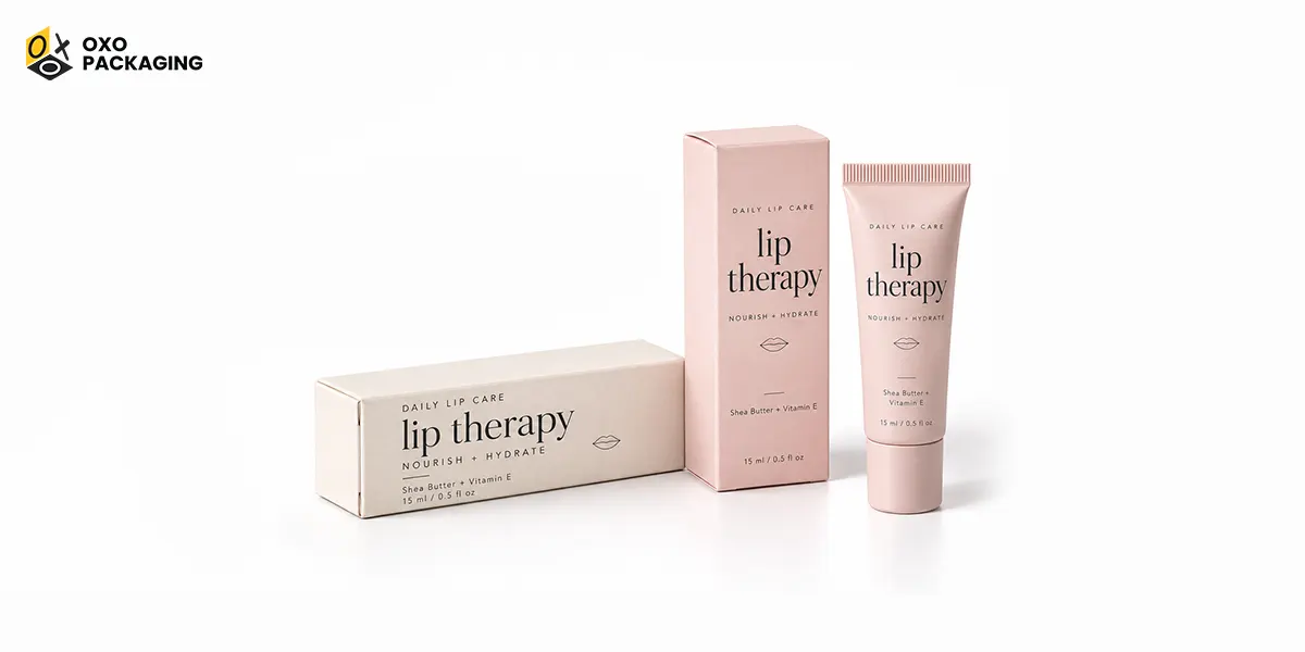
Premium beauty brands favor timeless typography over passing trends. Embracing clean fonts and generous, thoughtful spacing (kerning) creates an atmosphere of confidence. On a crowded retail shelf, sometimes the simplest, clutter-free text layout communicates the highest quality. Take inspiration from Glossier’slip balm boxes, featuring clean typography, gentle pastel backdrops, and immense breathing room.
Balancing Personality with Practicality
Many successful beauty brands use different styles while balancing their personality with practicality. A professional visual hierarchy often uses:
- An elegant Serif for the logo, headlines, and product names to establish luxury and brand identity.
- A contemporary Sans-Serif for body text, ingredient lists, warnings, and usage instructions to ensure flawless readability across various package sizes.
Key Considerations for Cosmetic Box Design
While choosing typography for your cosmetic boxes, consider the instructions below to get flawless print:
- Aesthetic vs. Usability: Beautiful design must never compromise readability. Text must remain sharp and legible on tiny physical labels as well as digital screens.
- Font Weight Flexibility: Invest in a well-designed font family with multiple weights (e.g., light, regular, bold). This allows you to build a clean hierarchy on your box layout while keeping a unified look.
- Color Synergy: Pair typography with a complementary color palette. Soft neutral tones with elegant serifs feel like a luxury boutique. However, bright colors with geometric sans-serifs radiate youthful, innovative energy.
- Omnichannel & Global Consistency: Your box typography must remain identical across Instagram, e-commerce sites, and store shelves to build trust. If expanding globally, ensure your chosen fonts offer multilingual support to keep your international ingredient labels visually consistent.
Place Your Branded Logo Strategically
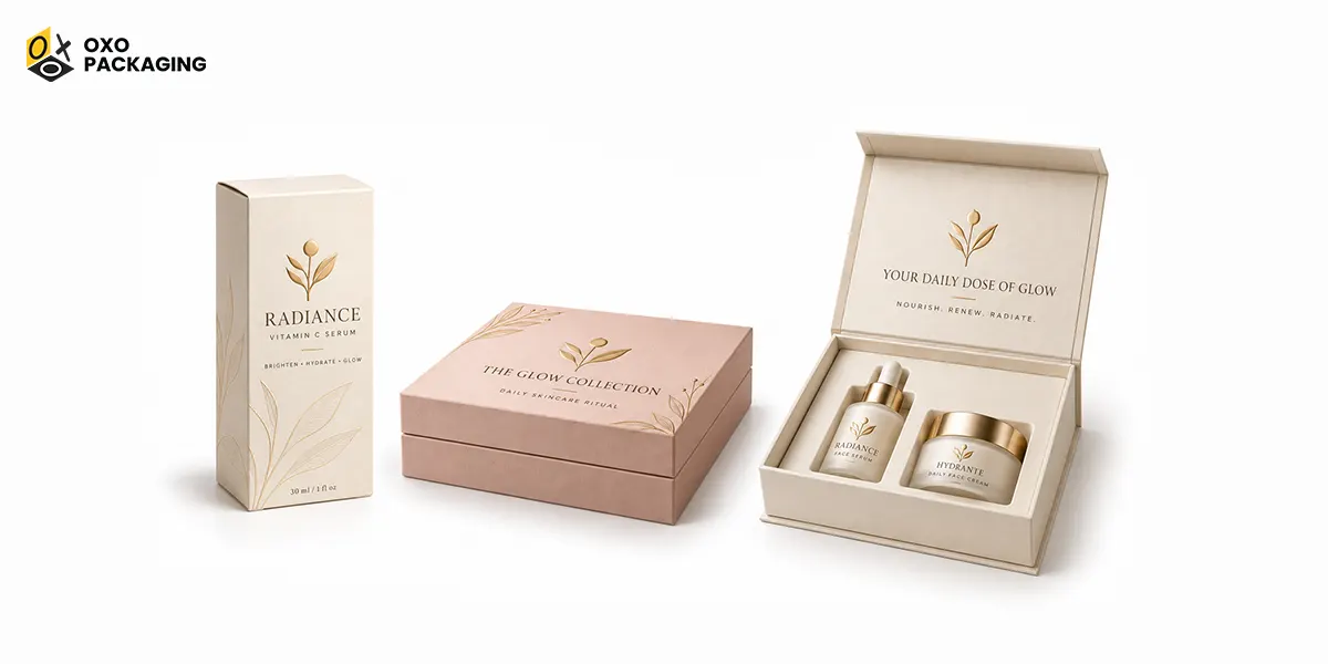
Once you have mastered your typography, the next significant step is positioning your logo. A cosmetic box must balance structural design with visual art. The geometry of your cosmetic packaging affects exactly where the human eye goes first:
-
Dominate the Principal Display Panel (PDP)
The Principal Display Panel (PDP) is the front face of your cosmetic box that’s your primary retail real estate. To maximize shelf impact, position your logo within the upper-third portion or dead center of this panel. This aligns perfectly with natural eye-level scanning patterns, ensuring consumers recognize your brand identity within seconds on a crowded retail shelf.
-
Align Layouts with Box Structure
Different box structures require distinct geometric strategies to ensure a flawless customer unboxing experience:
- Folding Cartons: Keep logos and crucial text lines safely inside a designated print zone, away from side glue seams, score lines, and structural tab folds to prevent the ink from cracking or warping.
- Rigid Lid-and-Base Boxes: Commonly used for luxury skincare sets or premium perfumes, the absolute center of the top lid panel is the optimal focal point.
- Book-Style / Magnetic Boxes: Place the primary branding elements along the opening flap or geometric center to guide the customer's eye as the package unfolds.
-
Premium Finishes and Structural Safety
To make your typography and logo stand out against soft neutral or vibrant backdrops, leverage specialty print finishes. Techniques like embossing/debossing or metallic foil stamping add a tangible luxury haptic feel that increases your product's perceived value the moment customers pick them up.
-
Strategic Placement by Buying Channel
Your layout strategy should adapt directly to where and how a customer purchases your product:
- Retail Cartons: Prioritize the Principal Display Panel (PDP). Position the logo within the upper-third portion or dead center of the main front face to ensure strong, immediate shelf recognition on crowded retail displays.
- E-commerce Mailers: Shift the focus toward the top outer panel and the inside lid. This utilizes the unboxing journey as a premium storytelling experience the moment the mailer is opened on a customer's doorstep.
- Gift and Luxury Boxes: Utilize the top lid panel as a clean canvas. Elevate the branding using tactile, high-end specialty finishes like metallic foil stamping, embossing, or debossing to maximize premium appeal.
Wrap Up!
At the end of the day, great custom packaging boxes for beauty products come down to a simple balance. That includes picking the right fonts and putting your logo exactly where customers look first.
When you get this combination right, your cosmetic boxes do the selling for you before a customer even opens the lid. If you are ready to bring your design ideas to life with flawless printing, beauty brands should choose custom cosmetic boxes from OXO Packaging.
These boxes can be eco-friendly depending on the materials used. If they are made from paper-based materials and water-based inks, then lip gloss boxes are eco-friendly
The most beautiful cosmetic packaging design includes negative space, crisp typography, and neutral tones, as seen in The Ordinary or clean monochrome facial serums
Cosmetic product labels must display the product's identity, net quantity, manufacturer or distributor name and address, ingredient list, and any required safety warnings in descending order.
Creative cosmetic packaging revolves around interactive, eco-conscious, and nostalgic themes tailored to modern consumers.






 Let's Call